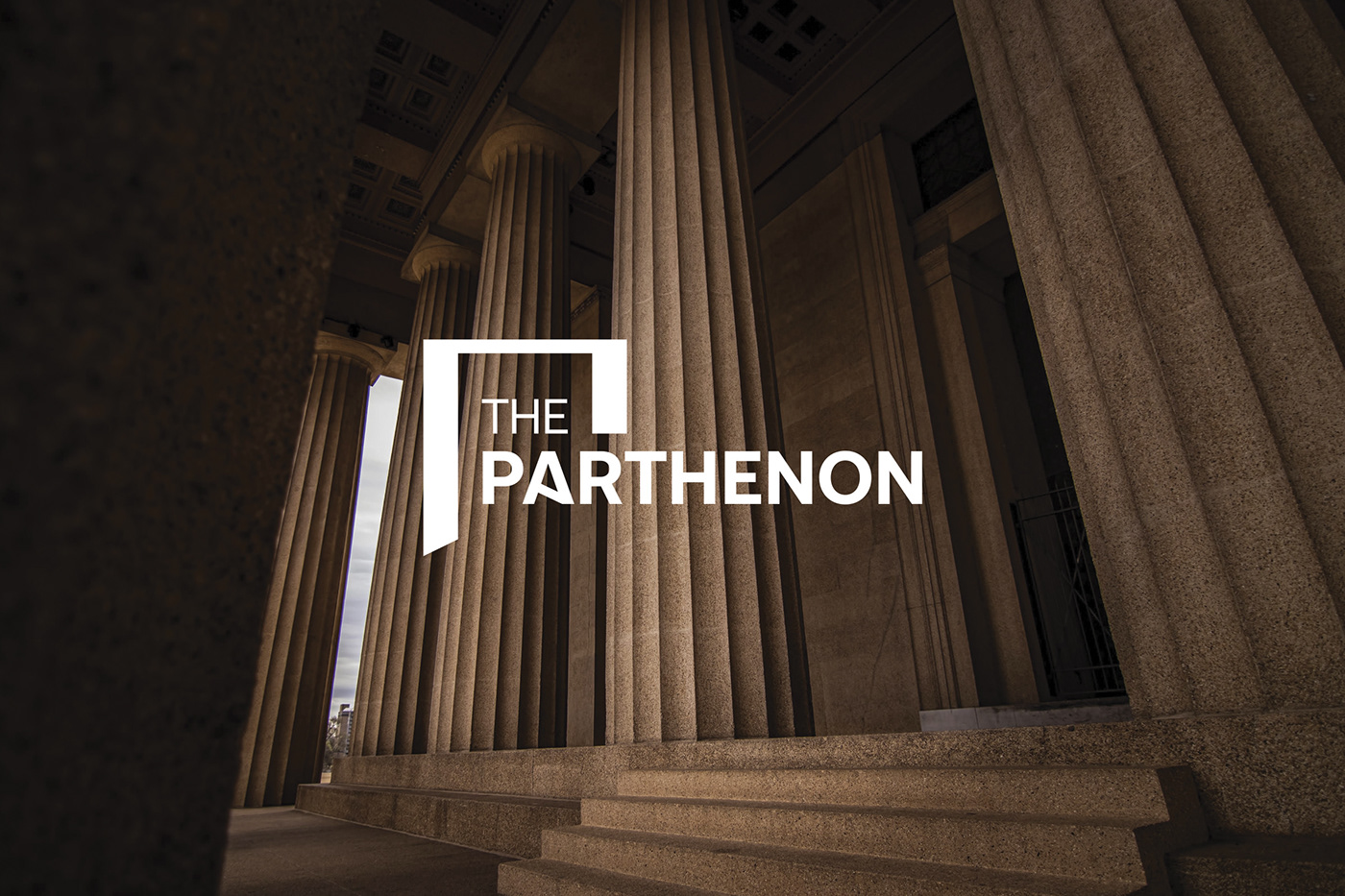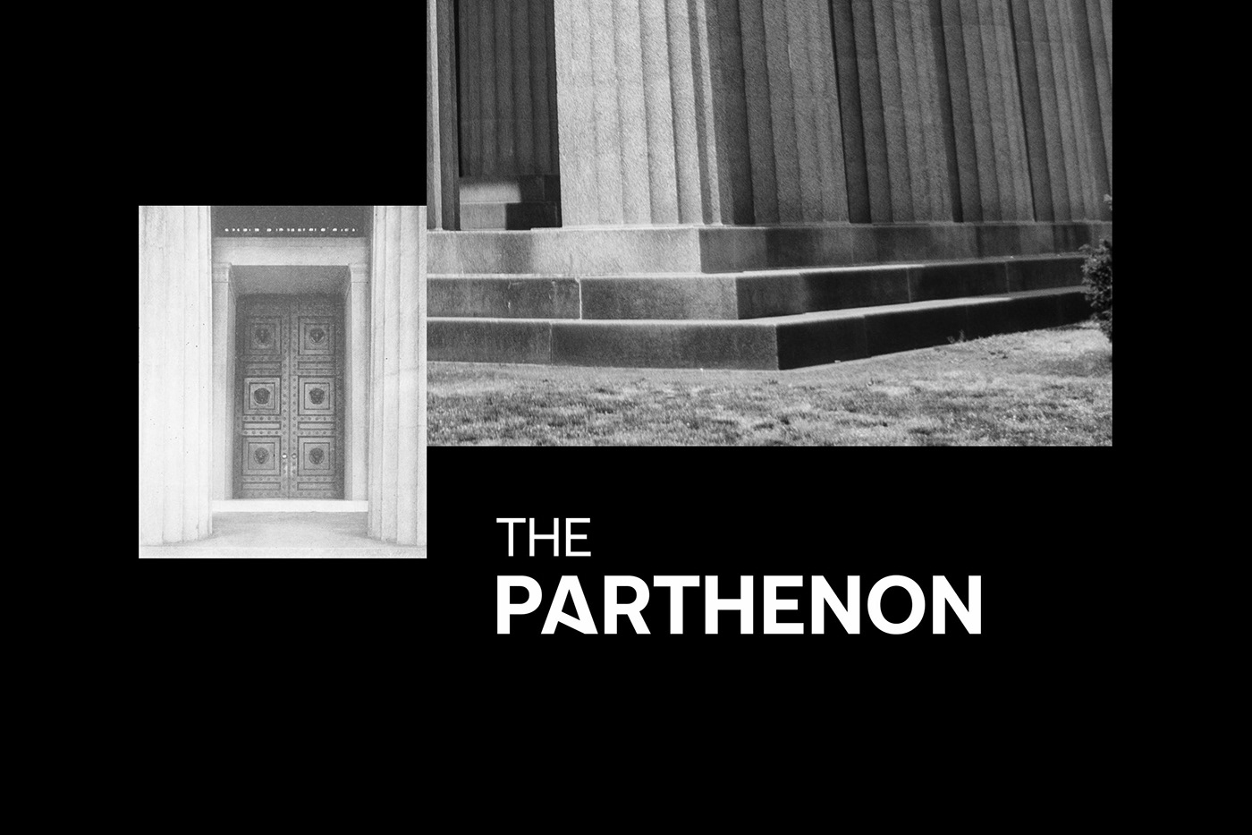


Description: Rebranding, with a new Logotype and color palette for the unique complete Parthenon replica, constructed in 1897 and operated by the Metropolitan Government of Nashville (Tennessee, US) as a cultural center.
Strategy: The project developed upon two strategic axes – challenges: First, the communication of the ancient Greek heritage using modern American civilization codes. Second, the augmentation of the visitors who decide to visit the inner spaces of the building, responding to a visual invitation, embedded into the new logotype.
Logo Design: The core of the logotype is the Greek letter ‘’P”, which is not only the initial letter of “Parthenon” but of ‘’Pili’’ and ‘’Porta’’ as well, the Greek words for ‘’Gate’’ and ‘’Door’’ respectively. The thickness of the symbol’s joists, as well as the cutting to the lower-inner part of the left one, are specially designed to transfuse the sense of the 3rd dimension and drive gazes inside ‘’THE PARTHENON’’ through its open gate: humans are always following their eyes! The symbol is reinforced by the brand name, which passes through it, in order to underline the existence of an open passage.
Cover photo by: Brice Cooper